UWE research group.
As a group we have been set the task of contacting designers regarding branding. We have chosen a question and will use the responses that we get as a bases to an answer.
Screen Printing our handouts
this took a while!
OUR PRESENTATION
Introduction
Hello, We are Emily, Ellen and James. Today we are going to discuss the question: “How do brands stay current in times of change?” Living in such a fast moving world has a large effect on branding and the direction it is moving in. Nowadays, companies are constantly striving to create a brand that performs on many different levels, not just static graphics or logos are good enough anymore.
Hello, We are Emily, Ellen and James. Today we are going to discuss the question: “How do brands stay current in times of change?” Living in such a fast moving world has a large effect on branding and the direction it is moving in. Nowadays, companies are constantly striving to create a brand that performs on many different levels, not just static graphics or logos are good enough anymore.
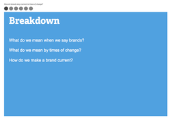
We are going to break it down in to three different questions for a more in depth look.
What do we mean when we say brands?
What do we mean by times of change?
How do we make a brand current?
What do we mean when we say brands?
What do we mean by times of change?
How do we make a brand current?
What we mean when we say brands…
The word “brand” is derived from the Old Norse brandr meaning “to burn”. It refers to the practise of producers burning their mark (or brand) on to their products.
A brand is not just a logo. Logos are merely representations of the brand. They are like a shortcut in your mind that represents the brand. A brand is the emotional and psychological relationship held with customers. Strong brands can elicit opinions, emotions and sometimes psychological responses from customers.
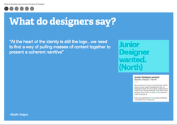
Studio output- a creative agency based in London and Nottingham. Comprising of 26 staff members stated: “ At the heart of the identity is still the logo… we need to find a way of pulling together masses of content together to present in a coherent narrative”
We find it interesting because they are looking for a Junior designer at the moment. They state that they are looking for one years experience in a studio, alongside being fluent in the adobe suite.
We find it interesting because they are looking for a Junior designer at the moment. They state that they are looking for one years experience in a studio, alongside being fluent in the adobe suite.
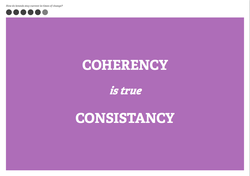
‘Someone’, a design agency based in London explained that a lot of traditional will make “blanding” not “branding”. Why does it become bland? Because people don’t care about a brands positioning, they care about a brands position. No one gets excited by consistency alone, its dull. Design-coherent communications allow brands to flex in to lateral, interesting ideas.
With branding come restrictions, however. To protect the brand, specific guidelines are often put in to place. These will determine how the brand can be used, where it can be used, and even how it is designed.
With branding come restrictions, however. To protect the brand, specific guidelines are often put in to place. These will determine how the brand can be used, where it can be used, and even how it is designed.
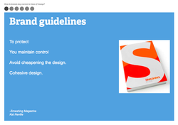
Kat Neville from Smashing Magazine argues that brand guidelines can help create a more cohesive design: “You’ll have an easy guide to refer to when handing over the project. You maintain control of the design. When someone does something awful, you can refer them to the document.
You avoid cheapening the design, message and branding. This forces you to define and hone your style, making a more cohesive design”.
You avoid cheapening the design, message and branding. This forces you to define and hone your style, making a more cohesive design”.
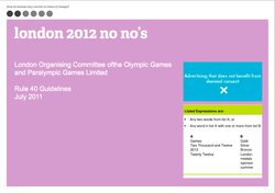
A prime case study of strict brand guidelines in use is the London 2012 campaign. They prohibited any use of the colour scheme and general design. They even became known as the ‘brand police’. A small florist in Stoke on Trent was forced to remove rings of flowers that she had placed in her shop window.
In the guidelines it states that you cant use any A words or B words together.
In the guidelines it states that you cant use any A words or B words together.
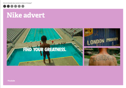
We found it interesting how Nike managed to get round these guidelines in quite a clever way. Nike hit back at the London 2012 campaign, after being frozen out by adiddas. They hinted at everything that is british, filmed their ads in other places called London and used relevant sports fields so that they could latch on to the olympic spirit and attach it to their brand.
What we mean by times of change…
Today, we are bombarded with different mediums of technology to communicate and express ourselves. For example; Social networking sites such as Facebook and Twitter. 10 years ago, a mobile phone was just a ‘phone’. Now there are apps and tablets, whole new virtual worlds open to explore.
This has a snowball effect on branding and advertising and how companies see themselves and their audiences.
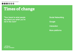
“Your brand is what people say about you when your not in the room”- Founder of amazon.
Today, we are bombarded with different mediums of technology to communicate and express ourselves. For example; Social networking sites such as Facebook and Twitter. 10 years ago, a mobile phone was just a ‘phone’. Now there are apps and tablets, whole new virtual worlds open to explore.
This has a snowball effect on branding and advertising and how companies see themselves and their audiences.
“Your brand is what people say about you when your not in the room”- Founder of amazon.
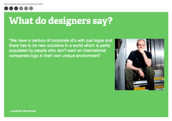
Barnbrook is one of the most well known creative studios in Britain. He specialises in book design, corporate identities, websites and magazines. We got in contact with him and he commented, “We have a century of corporate ids with just logos and there has to be new solutions in a world which is partly populated by people who don’t want an international companies logo in their own unique environment”.
So this appears to show that nowadays, there is becoming a trend in which people are more savvy towards generic logos and brands. They need something more. This makes the designers have to think more carefully about projecting the brand.
So this appears to show that nowadays, there is becoming a trend in which people are more savvy towards generic logos and brands. They need something more. This makes the designers have to think more carefully about projecting the brand.
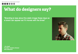
Tim Swift, from man vs machine, a design and motion company based in London Backs this up by saying, “Branding is less about the static image these days so a brand can appear as if it moves with the times”
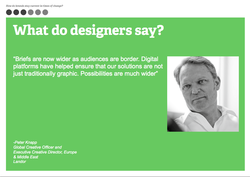
Peter Knapp, Global creative Offcier and executive creative director at Landor: Europe and Middle East.
“Briefs are now wider as audiences are broader. Digital platforms have helped ensure that our solutions are not just traditionally graphic. Possibilities are much wider”.
“Briefs are now wider as audiences are broader. Digital platforms have helped ensure that our solutions are not just traditionally graphic. Possibilities are much wider”.
Brands design nowadays have to be more coherent as all users don’t see the same content e.g apps and tv adverts.
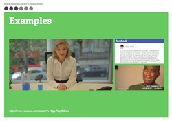
A particularly good example of a brand keeping up with the times comes from the recent ad campaign from ‘bodyform’.
This started by a written message on Facebook from a male member of the public, claiming he felt misled by the idyllic bodyform adverts, saying he was not prepared for the reality of a womans time of the month. Bodyform bit back and produced a viral youtube video in response giving a sarcastic and humourous apology.
http://www.youtube.com/watch?v=Bpy75q2DDow
So…..How do you actually make a brand current?
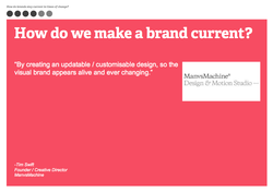
Tim Swift suggested “By creating an updatable, customisable design, so the visual brand appears alive and ever changing.”
Tim Swift suggested “By creating an updatable, customisable design, so the visual brand appears alive and ever changing.”
Dan Lecivita, from New york based digitial design agency: Firstborn states, “Its about trying to find effeciencies without sacrificing creativity- making a great piece of content that can live in multiple.”
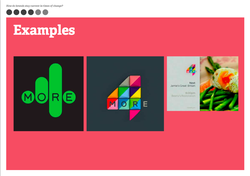
The More 4 rebrand is an example of a new and current design. The original branding for more4 is very bold, minimal and uncompromising. The colour choices gave more4 a very unique and grown up look which worked for their original content.
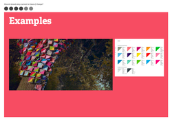
Man vs machine, 4creative and installation designer Jason Bruges are the masterminds behind the rebrand. More4 was relaunching and wanted a concise change. Mike Alderson; co-owner of manvsmachine says, “Any evolution of the old logo would be wrong”. The new logo was about what the channel had become, bringing in new versatile content. This called for a strong flexible, warm and tactile identity. The coloured triangles are movable“flippers”, made out of polypropylene plastic. The pantone colours were carefully selected to exude the right feel.
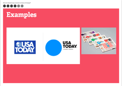
The rebrand of USA today newspaper is another great example of a rebrand that is keeping up to date with times of change and covering all media platforms.
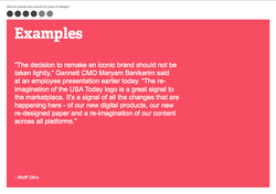
“The re-imagination of the USA Today logo is a great signal to the marketplace. It’s a signal of all the changes that are happening here - of our new digital products, our new re-designed paper and a re-imagination of our content across all platforms.” — Wolff Olins blog post, Designer of the new USA rebrand.
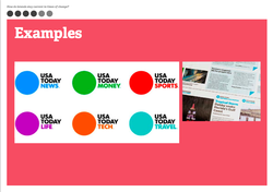
USA TODAY’s logo was redesigned to be as dynamic as the news itself. The logo will be a live infographic that can change with the news. It is simple and straight to the point, providing the opportunity for the newsroom to highlight the stories that matter to the nation. The logo will be used as a platform to express USA TODAY’s editorial spirit — fun, bold and impactful.
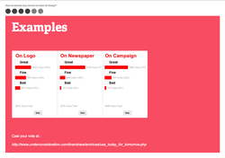
‘Underconsideration’, a rebrand based blog created by Graphic designer Armin Vitt and Bryony Gomez-Palicio writer and Graphic designer. Produced a voting system on all their posts, where you can contribute your opinion of a new logo or brand. Its interesting that only 49% of the people think the logo is great, though over 70% think that the overall idea of the brand is fantastic. This almost suggests, that logos are not wholly central in creating a fluid and coherent identity.